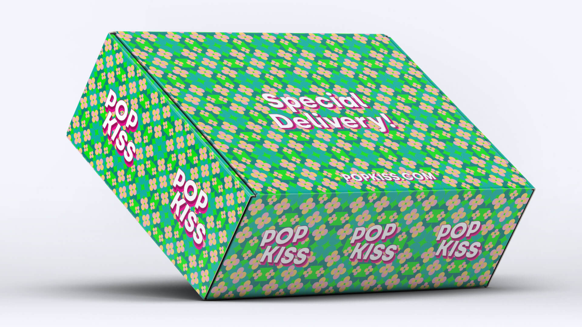
POPKISS' creation begins with a strong investment in branding, strategy and brand communication, solidifying the conceptual core of the project. The guarantee of formal and strategic coherence is the foundation of a brand that searches for universality, to be featured and ( why not ) a little fun!

The graphic identity focuses itself on a toolkit which defines an approach focused on POPKISS' immediate reading, boldness and personality. The logotype is designed in black and white so that it can, later on, be absorbed by its hysteric and loud communication. What most characterizes the brand's identity is that it's fully based on POP culture, and, as such, it's constantly evolving and mutating in a loop. It's a brand that is not afraid of being loud, being spontaneous and communicating lower prices. The brand's toolkit is mostly made out of key principles, that can change and adapt to any circumstance, always granting a cohesive communication in any medium. By creating the brand, its name, market positioning and communication system, studium has full control over how every all of the brand's key points interact with each other, resulting in a solid communication from brand narrative to the graphic outcome of campaigns and overall communication. It is also another reflection of one of studium's trends, stupopium, focused on studying the influence of POP culture within the studio's work.